Perhaps a better question is: ``How can we tell if
the pattern of measurements is changing?'' Change is observed difference
over time, so to see if the pattern of KWH values is changing, we should
display them over time. Figure ![]() is such a display. In fact it is two
displays in one. On the left is a scatterplot, showing the KWH
values on the vertical axis and the date they were observed on the
horizontal axis. On the right is a horizontal bar chart showing the
distribution of KWH values. Its vertical axis is on the same scale
as the vertical axis of the scatterplot. The scatterplot shows how the
KWH values vary with time. Note that observed KWH increases nearly
linearly with time, with only small deviations about the line noticeable
on the plot. This plot answers the question easily: the pattern of KWH
values is changing over time; the values are
increasing at a linear rate.
Therefore the process generating the KWH readings is not stable.
is such a display. In fact it is two
displays in one. On the left is a scatterplot, showing the KWH
values on the vertical axis and the date they were observed on the
horizontal axis. On the right is a horizontal bar chart showing the
distribution of KWH values. Its vertical axis is on the same scale
as the vertical axis of the scatterplot. The scatterplot shows how the
KWH values vary with time. Note that observed KWH increases nearly
linearly with time, with only small deviations about the line noticeable
on the plot. This plot answers the question easily: the pattern of KWH
values is changing over time; the values are
increasing at a linear rate.
Therefore the process generating the KWH readings is not stable.
This example teaches us two valuable lessons:
There is an explanation for the observed pattern in the KWH values. These
values are cumulative: today's
reading is yesterday's reading plus the number of KWH used since then;
tomorrow's will be today's plus the number of KWH used between now and
then. We would not expect these readings to constitute a stable process,
but what about the daily electric usage? This is easily obtained by
differencing, that is, subtracting from each day's meter reading
the reading from the previous day. Figure ![]() displays the daily KWH usage
(DKWH) versus time in the scatterplot on the left, and a horizontal bar
chart of daily KWH usage on the right. Whatever pattern exists in this
scatterplot is much less apparent than in Figure
displays the daily KWH usage
(DKWH) versus time in the scatterplot on the left, and a horizontal bar
chart of daily KWH usage on the right. Whatever pattern exists in this
scatterplot is much less apparent than in Figure ![]() . What is more apparent
is that the bar chart is skewed (i.e. non-symmetric) toward large values of
DKWH. Since skewness makes interpretation difficult, we have transformed
DKWH by essentially taking the log of DKWH several times.
. What is more apparent
is that the bar chart is skewed (i.e. non-symmetric) toward large values of
DKWH. Since skewness makes interpretation difficult, we have transformed
DKWH by essentially taking the log of DKWH several times.
The resulting
variable, TDKWH, is plotted in a scatterplot and bar chart in Figure ![]() .
While the bar chart shows that the transformation has made the
distribution more symmetric, it is still difficult to judge the stability
of the process from the scatterplot. A time series plot, which
connects points at consecutive times with lines, can help assess process
stability. Figure
.
While the bar chart shows that the transformation has made the
distribution more symmetric, it is still difficult to judge the stability
of the process from the scatterplot. A time series plot, which
connects points at consecutive times with lines, can help assess process
stability. Figure ![]() is a time series plot of TDKWH.
While there is a good deal of variation in the series as evidenced in
the vertical oscillations, there seems to be a curved trend to the data,
with a general level that rises from October to January and then declines
from January to April.
is a time series plot of TDKWH.
While there is a good deal of variation in the series as evidenced in
the vertical oscillations, there seems to be a curved trend to the data,
with a general level that rises from October to January and then declines
from January to April.
In order to better judge the underlying trend in the data, we next
resort to smoothing methods to suppress the high frequency
oscillations (also known as ``noise''). There are many ways to do this,
but we will use the simplest, called the moving average. The idea
of a moving average is very simple: each data value is replaced by
the average of itself, the observation occurring immediately before it in time
and the observation occurring immediately after it in time.
Thus, for example, a 3 term moving average replaces the observation at time
t,  , by the average
  .
.
The first five observations of the TDKWH data are
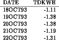
To compute the three term moving average  for t=19OCT93, we average the TDKWH values
for 18OCT93, 19OCT93 and 20OCT93 and obtain
for t=19OCT93, we average the TDKWH values
for 18OCT93, 19OCT93 and 20OCT93 and obtain

Try computing  for t=20OCT93 and 21OCT93 (the answers are -1.32 and -1.29).
We could have used a 3 term moving average to smooth the TDKWH data, but after thinking about it a bit, we decided that a 7 term moving average might be a better choice. A 7 term moving average replaces the observation at time t with the average of itself and the 3 preceding and 3 succeeding data values.
In deciding to use a 7 term moving average we reasoned as follows: our society runs on a number of cycles, and one of the most basic is the weekly cycle (doesn't everyone look forward to the weekend?). It's the same with Professor P.'s household. During the week his kids are in school, he is at work and his wife is either working or running errands. On the weekend, everyone is home using lights, TV, computer and Nintendo, doing laundry and vacuuming, and so on. So it makes sense that electric usage would follow a 7 day cycle. More advanced statistical methods applied to the TDKWH data also confirmed the existence of a 7 day cycle (and also cycles, called harmonics, at multiples of 7 days: 14, 21 and 28 day cycles, for example).
Figure ![]() shows the 7 term moving average (dotted line) superimposed on the time series plot of TDKWH.
Notice that the moving average follows the overall trend (what an engineer might call the signal),
but does not contain the large up and down variation (what an engineer might call the noise)
in the raw data. This is why it is called a smoother. This also
illustrates a general rule of statistics:
shows the 7 term moving average (dotted line) superimposed on the time series plot of TDKWH.
Notice that the moving average follows the overall trend (what an engineer might call the signal),
but does not contain the large up and down variation (what an engineer might call the noise)
in the raw data. This is why it is called a smoother. This also
illustrates a general rule of statistics:
Figure ![]() illustrates this further. The dotted line is a 28 term moving
average
illustrates this further. The dotted line is a 28 term moving
average![]() [1]Some may be wondering how a l term moving average is computed when l is even
(as 28 is).
This is a technical matter and need not concern us here. However, for those who are curious,
details are explained in Appendix I of this module: Computing a Moving Average with an Even Number of Terms.,
selected because it is at a harmonic frequency and because it represents roughly
a monthly cycle. Notice how it is even smoother than the 7 term moving average.
[1]Some may be wondering how a l term moving average is computed when l is even
(as 28 is).
This is a technical matter and need not concern us here. However, for those who are curious,
details are explained in Appendix I of this module: Computing a Moving Average with an Even Number of Terms.,
selected because it is at a harmonic frequency and because it represents roughly
a monthly cycle. Notice how it is even smoother than the 7 term moving average.
Both the 7 and 28 term moving averages of the data show that TDKWH is not stable: it has the
increasing and then decreasing trend that we first observed in Figure ![]() . The next
task of a data analyst would be to explain the observed trend, but we will leave that
to you in the the exercises.
. The next
task of a data analyst would be to explain the observed trend, but we will leave that
to you in the the exercises.
An example of a plot of a stable process is found in Figure ![]() . This plot shows
the measured thicknesses of 100 washers in mm plotted versus the order in which they were taken from
the production line. A 5 term moving average is superimposed on the plot. Notice that while there
is variation in the data, that variation has no systematic pattern.
. This plot shows
the measured thicknesses of 100 washers in mm plotted versus the order in which they were taken from
the production line. A 5 term moving average is superimposed on the plot. Notice that while there
is variation in the data, that variation has no systematic pattern.
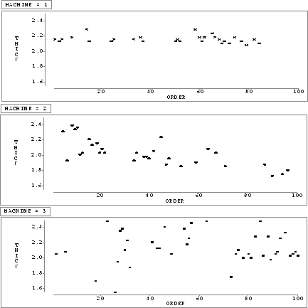
Figure: Plot of Thickness versus Order for Each Machine, First Example
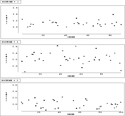
Figure: Plot of Thickness versus Order for Each Machine, Second Example