The data set SASDATA.ELECD contains 202 daily observations taken from Professor P.'s electric meter. Professor P. has been monitoring his household's electric usage in order to detect an in-ground water pump failure before it can do costly damage. The electric meter readings in kilowatt hours (under the variable name KWH) are read each morning and the variable DATE stores the date of the reading. The first five observations in the data set are:
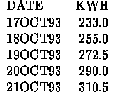
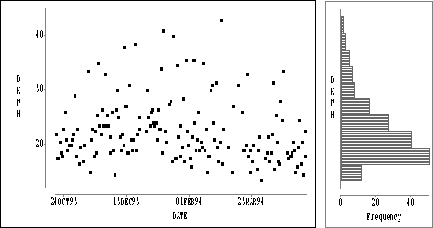
Figure: Plot of DKWH versus Date with Horizontal Bar Chart
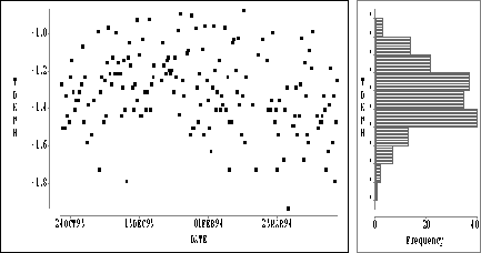
Figure: Plot of TDKWH versus Date with Horizontal Bar Chart
Figure: Time Series Plot of TDKWH
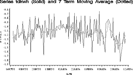
Figure: Time Series Plot of TDKWH with 7 Term Moving Average
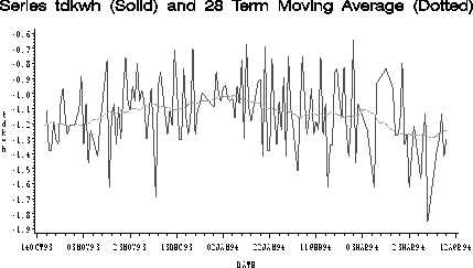
Figure: Time Series Plot of TDKWH with 28 Term Moving Average
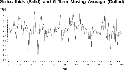
Figure: Time Series Plot of Thicknesses of 100 Washers
Even from the first five observations it is clear that there is variation
in the KWH readings. One of the tasks of statistics is to quantify the
variation in data, and that is what we will try to do here. A standard
tool for displaying the variation in data is the Bar Chart,
sometimes also called a Histogram. Figure ![]() displays a bar chart
for the KWH values.
displays a bar chart
for the KWH values.
Construction of a bar chart begins by breaking the
range of data values into a number of intervals and counting the
frequencies (or numbers) of observations in each interval. In a
vertical bar chart, such as that shown in Figure ![]() ,
the intervals are displayed on a horizontal axis. Above each interval
is drawn a vertical bar with height proportional to the frequency of
observations in that interval. A horizontal bar chart is obtained
by displaying a vertical axis and horizontal bars.
From Figure
,
the intervals are displayed on a horizontal axis. Above each interval
is drawn a vertical bar with height proportional to the frequency of
observations in that interval. A horizontal bar chart is obtained
by displaying a vertical axis and horizontal bars.
From Figure ![]() we observe that the KWH values seem to be more or less
uniformly distributed over their range. There are 14 observations
between 0 and 500, 21 between 500 and 1000, 20 between 1000 and 1500,
and so on. This means that tomorrow Professor P. will see a KWH reading
between the values of 0 and 5000, and further that any KWH reading in
that range is as likely to occur as any other. Or does it?
we observe that the KWH values seem to be more or less
uniformly distributed over their range. There are 14 observations
between 0 and 500, 21 between 500 and 1000, 20 between 1000 and 1500,
and so on. This means that tomorrow Professor P. will see a KWH reading
between the values of 0 and 5000, and further that any KWH reading in
that range is as likely to occur as any other. Or does it?
Think for a moment what it means to base a prediction of tomorrow's KWH value on these data. For one thing, it means that tomorrow's reading must come from the same process that generated the values in the bar chart. For another, and this is the most important point, it means that the pattern of measurements must not change
as more measurements are taken. We will call a process that satisfies this last condition a stable process. We can be reasonably sure that tomorrow's KWH measurement will be generated by the same process that generated the previous measurements (unless something drastic has occurred). But can we be confident that the pattern of measurements will not change?