Regression Analysis
By Kristine Sjogren and
11.4.2003
What is Regression
Analysis?
- A mathematical technique used to explain and/or predict.
- The most common form of regression is the linear form, Y = a + bX, where Y is the variable that we are trying to predict; X is the variable that we are using to predict Y.
- Linear Regression is the process of finding the equation of the line y = mx + b that comes closest to fitting given data points. It is called the regression line and is the one that makes the sum of the squares of the distances between the points and the line the smallest. It will normally pass below some points and above others.
- Regression analysis is a statistical technique used to estimate relationships.
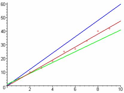
- Given the following data values and graph, one can see the red line represents a “best fit” for the data plotted.
- The blue line is y = 6x and the green line is y = 4x + 1. These lines represent guesses to fit the data, whereas the red line is the Maple generated best fit line. Notice the error from the data points is far less when using the red line than the other two.
- Data:
![]() :
: ![]()
![]()
Mathematical Foundations of Regression Analysis
· In an attempt to find a function that is closest to our actual data, or in other words, “with the least amount of error to fit the data,” there are several steps we must take.
o First, we must look at our data, and determine what type of “curve” it appears to simulate, i.e. linear, quadratic, or exponential.
· In the above case, it should be quite obvious, that the data appears to be linear.
o Secondly, we must use this information to determine a general error equation, which is a summation equation that is typically based on the difference (error) between each data point, yi, and the type of function (linear or quadratic). However, this is not the case in an exponential situation, as we will later discuss.
o Make a note: Calculus comes back!
o Once the error equation has been created,
we want to minimize the error, i.e.
create a line of “best” fit. To do this,
we need to find the critical points (when the first derivatives equal 0).
o This is done by setting the partial
derivatives of the error summation equation equal to zero.
·
Note:
the variables in our equations are a and b (or a, b, c in a
quadratic case). A common mistake is to
think of x and y as the variables!
o At this point, we are able to write a system of equations and use matrices in order to solve for the correct coefficients of our best fit equation.
Linear Case
· After the partial derivative is taken with respect to a, and then to b, the system of equations that results is:
·
![]()
·
![]() , where n = the number of data points, a and
b are
variables.
, where n = the number of data points, a and
b are
variables.
· Using Maple, any graphing calculator, or tool of your choice, we create a 2 x 3 matrix and to solve for the values of a and b.
· To write our general equation, we use the values of a and b, where a is the slope of the best fit line and b is its y-intercept; therefore, allowing us to write an equation in the form y = mx + b.
Quadratic Case
· After the partial derivative is taken with respect to a, b, and c, the system of equations that results is:
§
![]()
§
![]()
§
![]() , where n = the number
of data points.
, where n = the number
of data points.
§ Using Maple, any graphing calculator, or tool of your choice, we create a 3 x 4 matrix and solve it for the values of a, b, and c.
§
To write our general equation, we use the values
a, b, and c, where
a is
the coefficient of the quadratic term, b is the coefficient of the linear term, and c is the
constant term; therefore, allowing us to write an equation in the form ![]() .
.
Exponential Case (a bit different!)
·
When your data appears to simulate an exponential
case, such as ![]() , we use the natural log to create a linear
equation.
, we use the natural log to create a linear
equation.
o When you take the partial derivative, one of the variables is left in the exponent. As a result, we must use the natural log to obtain a linear system of equations.
o Remember
the rules of logs…
·
When your original data is exponential, the data obtained by plotting x versus the log of the y coordinates will be linear, so we
can find the best fit line. In this
case, the y intercept is the ln(a) and the slope is b.
·
Knowing that we obtain a linear function when
plotting x versus the log of the y coordinates, and knowing that our original
data is exponential, we write an equation in the form ![]() , which will be a “best fit” to our data.
, which will be a “best fit” to our data.
A Good Fit?
· The word correlation refers to the relationship between two variables.
· The correlation coefficient, known as r, between two variables is the statistic that measures the strength of the relationship between them on a unitless scale of -1 to 1.
o Example: Perhaps as the number of hunters increases, the deer population decreases. This is an example of a negative correlation: as one variable increases, the other decreases. A positive correlation is where the two variables react in the same way, increasing or decreasing together. The time spent exercising and the numbers of calories burned have a positive correlation because as one increases, the other does as well.
o By
observing the graphs, one can tell if there is a correlation by how closely the
data resembles a line. If the points are scattered about, then there may be no
correlation. If the points would closely fit a quadratic or exponential
equation, etc., then they have a nonlinear correlation.
· Most often, we are speaking about the linear relationship between the variables.
· A value of zero for r does not mean that there is no correlation; there could be a nonlinear correlation.
·
When you square r, you obtain the coefficient of
determination. The closer the value is to 1, the
greater the correlation there is between the two variables.
·
How do you find r?
o An
example by HAND:
o Given
(3, 30); (5, 38); (10, 46); and (13, 62), fill in the table below.
|
values for x - age |
values for x2 |
values for y- height |
values for y2 |
values for xy |
|
3 |
9 |
30 |
900 |
90 |
|
5 |
25 |
38 |
1444 |
190 |
|
10 |
100 |
46 |
2116 |
460 |
|
13 |
169 |
62 |
3844 |
806 |
|
S x = 31 |
S x2 =303 |
S y =176 |
S y2 =8304 |
S xy = 1546 |
2. The number of data points n = _____4_______.
3. Find ![]() =
=![]() =__7.75_____________ and
=__7.75_____________ and ![]() =
= ![]() =_______44_________.
=_______44_________.
4. Find the slope of the regression line ![]() =
_______2.900____
.
=
_______2.900____
.
5. Find the y-intercept of the regression line ![]() =
____21.5219_______.
=
____21.5219_______.
6. Write the equation of the regression line for this data set in the form
of y = mx +b.
y = 2.9x +21.5219
7. Use the previous equation to predict
the height of a 7 year old: ____41.825_____.
8. Find the correlation coefficient.,
r = ![]() =
______.9709_________.
=
______.9709_________.
9. Plot the given data points and sketch the graph of the regression line on the same coordinate system.
The correlation in this case is very close to 1, at .97, and this graph
demonstrates how close to perfect linear correlation this set of data falls.
An Application: SAT’s and TV viewing hours
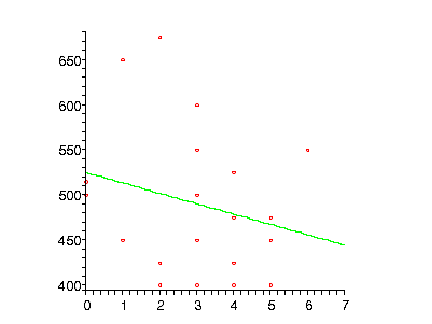
The following table shows TV viewing hours and SAT scores of 20 students.
|
TV viewing hours per day (x) |
SAT score (y) |
|
0 |
500 |
|
0 |
515 |
|
1 |
450 |
|
1 |
650 |
|
2 |
400 |
|
2 |
675 |
|
2 |
425 |
|
3 |
400 |
|
3 |
450 |
|
3 |
500 |
|
3 |
550 |
|
3 |
600 |
|
4 |
400 |
|
4 |
425 |
|
4 |
475 |
|
4 |
525 |
|
5 |
400 |
|
5 |
450 |
|
5 |
475 |
|
6 |
550 |
1. Use the correlation coefficient to find whether there is a strong or weak association between TV viewing and performance on the SAT.
2. Use linear regression to estimate the relationship between these two variables.
Recall that we did this already for a small data set by hand. This would be impractical for a large data set like this, so we will use a computer (Maple) to speed up the process.
Sat
Scores
Hours watching TV
This is a negative correlation and it is obviously not very strong. In fact, using a calculator, the correlation coefficient is -.2365, and is therefore a weak negative correlation.
Technology
- There are many mathematical tools that will compute the necessary coefficients for a “best fit” curve, but we have studied two of them: Maple and a typical graphing calculator.
Maple
- Pros
- Maple displays graphical information very well.
- Graphs are colorful and pleasing to the eye.
- Graph size can easily be manipulated to show large amounts of data.
- The graphs are easy to cut and paste into any other type of presentation software.
- It gives us the necessary coefficients in either fractional or decimal form.
- Very simple to change data and look at different scenarios
- Cons
- It is very difficult to learn the correct program codes for Maple.
- It may be more time consuming to enter the correct codes than it would be on a graphing calculator.
- It is necessary to have a computer at your disposal.
Graphing
Calculator
- Pros
- Graphing calculators are very accessible because they are a lot cheaper than computers.
- If you still have the owner’s manual, the process is simple.
- Students are more familiar with the calculators and it makes it easier to teach on them.
- Cons
- The screen on the graphing calculator is too small to see large amounts of data.
- Curve is not fluent. Difficult to see, as there is no color to differentiate graphs or other details.
- Coefficients are computed as decimals to about 9 places.
Recommendation
· Maple is an all around better tool than the graphing calculator. Once you get past learning the code, the options are endless with this program.
The Secondary Curriculum
· In secondary education, regression analysis can be applied to various subject matters from Algebra to AP Statistics. The topic can be covered in as much or as little detail as the teacher decides.
·
From basic Algebra:
o
In Algebra, the students typically learn how to
plot points and create a scatter plot, and then learn how to approximate a best
fit line by eyeballing their data
and calculating the slope.
o
They will learn if the slope is positive or
negative, and this can be identified as the relationship
between the two variables.
o
They will learn to extrapolate data by predicting future or past data values
using their equation.
·
To advanced Statistics:
o
In an elementary or advanced statistics course,
students will learn about correlation,
the correlation coefficient, hypothesis testing for a correlation
coefficient, and about correlation and causation.
o
Then, the students will examine regression lines, and applications of regression lines.
o
Finally, the unit can be extended to include the
coefficient of determination, the standard error of estimate, and prediction intervals.
·
In either case:
o
Students will learn a basic understanding of positive
correlation and negative
correlation and how to identify trends in the data.
o
Interpolation and extrapolation will be
identified by equation or using technology.
o
The greater the depth of the unit, the more
information the students will need about regression analysis and how to
calculate correlation on a computer or graphing calculator.
Appendix: Terminology for the Novice
Regression: Galton's original regression concept considered the variance of both variables; however, the word "regression" later became synonymous with the least squares method, which assumes the X values are fixed.
In statistics, regression refers to the technique used to explain and/or predict the relationship between the data points.
Least Squares: The name "least square"
comes from the process of defining a trend line. The line is adjusted until the
sum of the squares of the y deviations from the line (shown above in
blue) is as small as possible.
Interpolation: Often experimental results are available for selected conditions, but values are needed for intermediate conditions. The estimation of such intermediate values is called interpolation.
Extrapolation: Extrapolation is the extension of such data beyond the range of the measurements. However, extrapolation must be used carefully, as trying to predict data values too far away from the last data point, may result in unrealistic results.
THE END!